Arrival screen as authored atmosphere
The opening state frames Mercy, Oregon as a place that has already been written. Typography, spacing, and menu plaques establish dread before the player takes the first action.
Case Study
ReWritten imagines a horror experience where the UI does more than relay information. Menus, prompts, and feedback states become part of the tension, helping each choice feel psychologically loaded without losing readability.
Overview
Problem
Survival interfaces often communicate danger, but they rarely make the interface itself feel implicated in the player's decisions.
Audience
Horror players who enjoy slow-burn tension, lore, and choice-heavy interaction, especially players who read interface details as part of the atmosphere.
Role
Concept direction, game UI design, interaction design, and narrative systems framing.
Scope
Define the player lens, establish the core UI principles, and translate them into title, exploration, archive, and evidence states that feel readable without losing dread.
Outcome
A stronger case study that highlights ReWritten as a mobile game UI concept through a clearer hero, a screen system, dedicated UI pieces, and storyboarded moments that show how the interface behaves under pressure.
UI Bet
Let the interface reflect uncertainty and consequence, while still staying readable enough for survival play.
Format
Focus the first pass on a mobile concept, where every prompt, state change, and hierarchy shift has to work within a tighter frame.
Target User 1
Needs prompts and decision states that feel weighty without becoming visually confusing in a high-tension moment.
Think first
Target User 2
Needs interface cues that reward observation, making notes, fragments, and feedback feel like part of the fiction instead of disposable overlays.
Reads for meaning
Target User 3
Needs the UI to preserve dread and uncertainty, so readability stays intact without flattening the emotional tone of the game.
Tension over noise
The concept gets stronger when the UI rules are explicit. These principles define how the interface can heighten tension without turning into noise.
Clarity has to survive the tension
When stakes rise, the interface can become tighter, sharper, or less comforting, but the player still needs to understand what matters immediately.
Choices should feel psychologically loaded
Decision prompts are not just navigation. Their framing, pacing, and visual treatment should make the player hesitate and question what each option means.
Feedback should signal consequence, not just completion
UI responses should suggest that something changed in the world or the player's understanding, making even small interactions feel suspiciously important.
The session moves from arrival to exploration, investigation, and consequence review without ever leaving the fiction. What changes from beat to beat is not just the screen content, but the hierarchy, pacing, and pressure inside the UI.
This gameplay flow video shows how ReWritten escalates through its core loop, using interface shifts to carry story tension rather than treating each screen as an isolated mockup.
The screen set makes the concept more concrete. Each state uses the same visual language, but the hierarchy changes depending on whether the player is entering, exploring, reviewing consequences, or reading evidence.
The opening state frames Mercy, Oregon as a place that has already been written. Typography, spacing, and menu plaques establish dread before the player takes the first action.
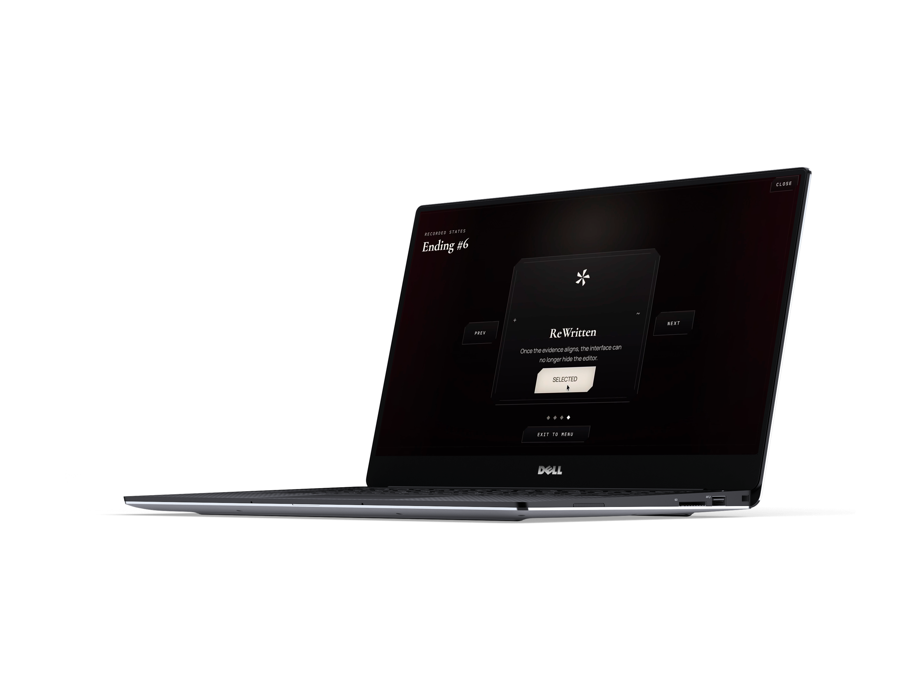
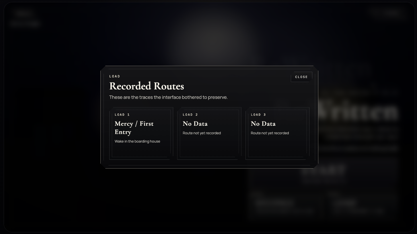
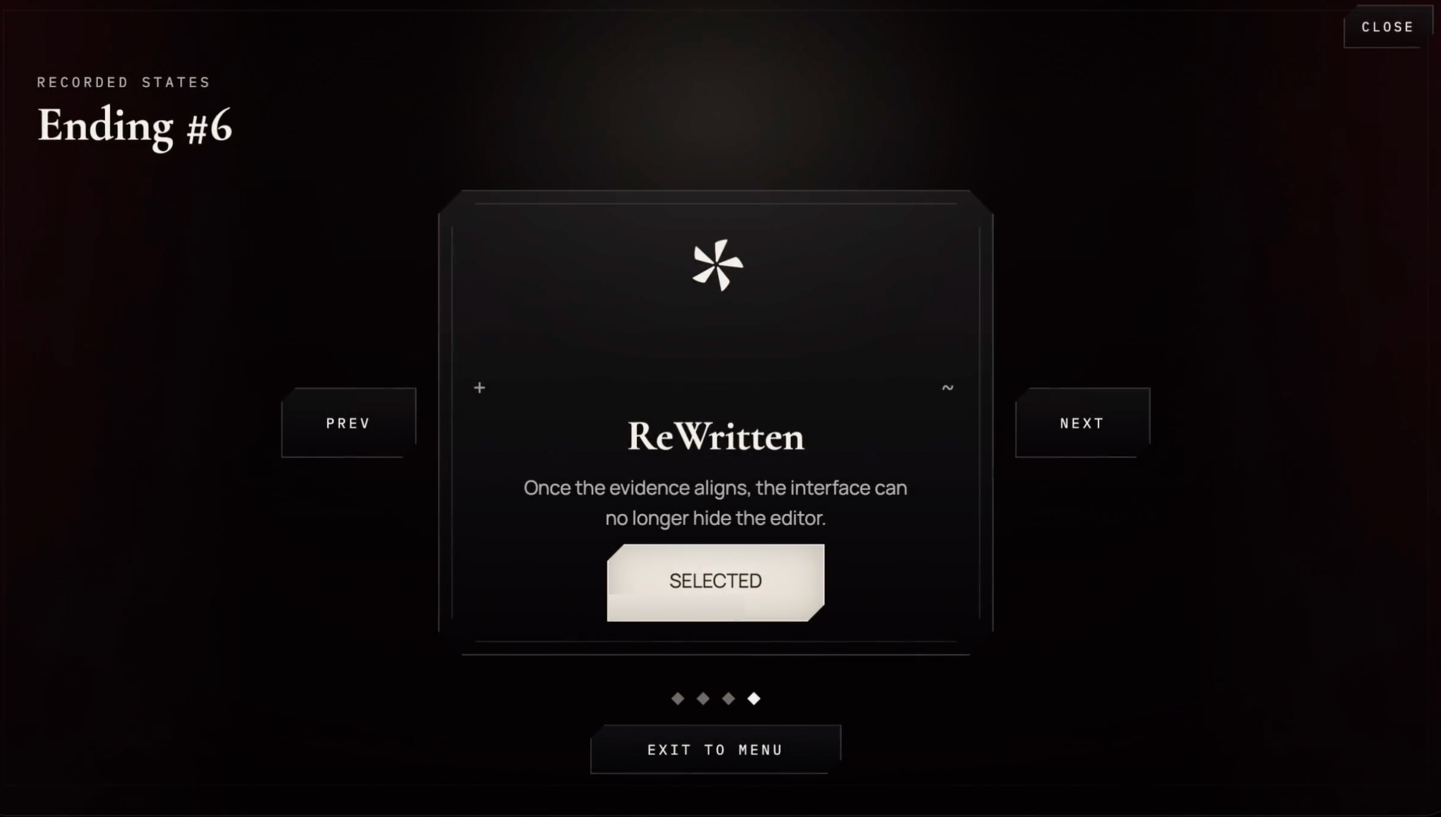
The recorded routes view treats save slots like authored evidence. It turns load-state utility into a fiction-bearing surface instead of a generic menu.

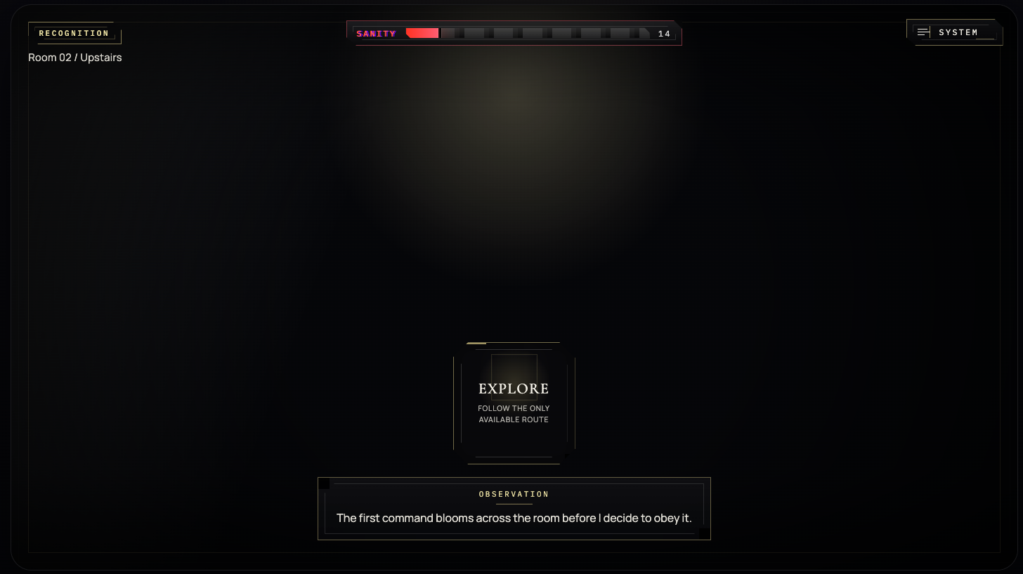
The exploration state compresses the interface to its essentials. Sanity, location, and one suspect command remain visible while the rest of the room falls away.
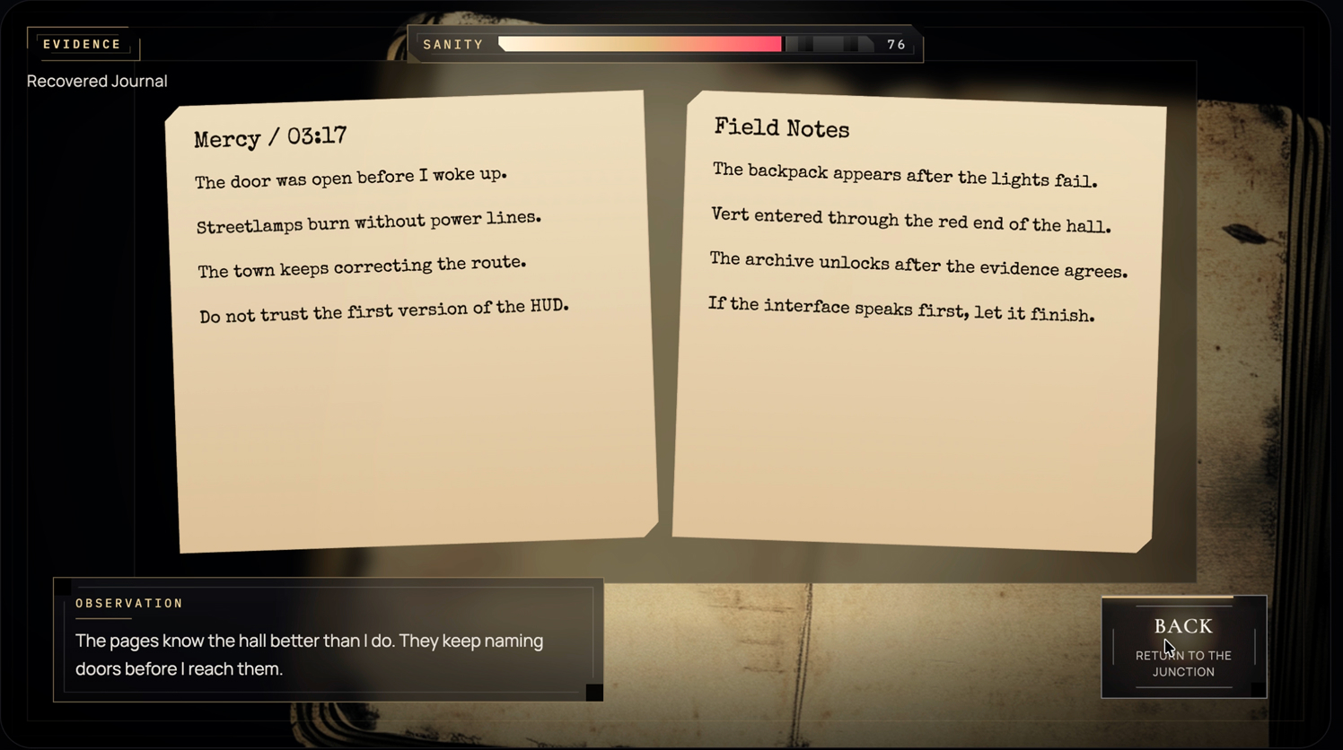
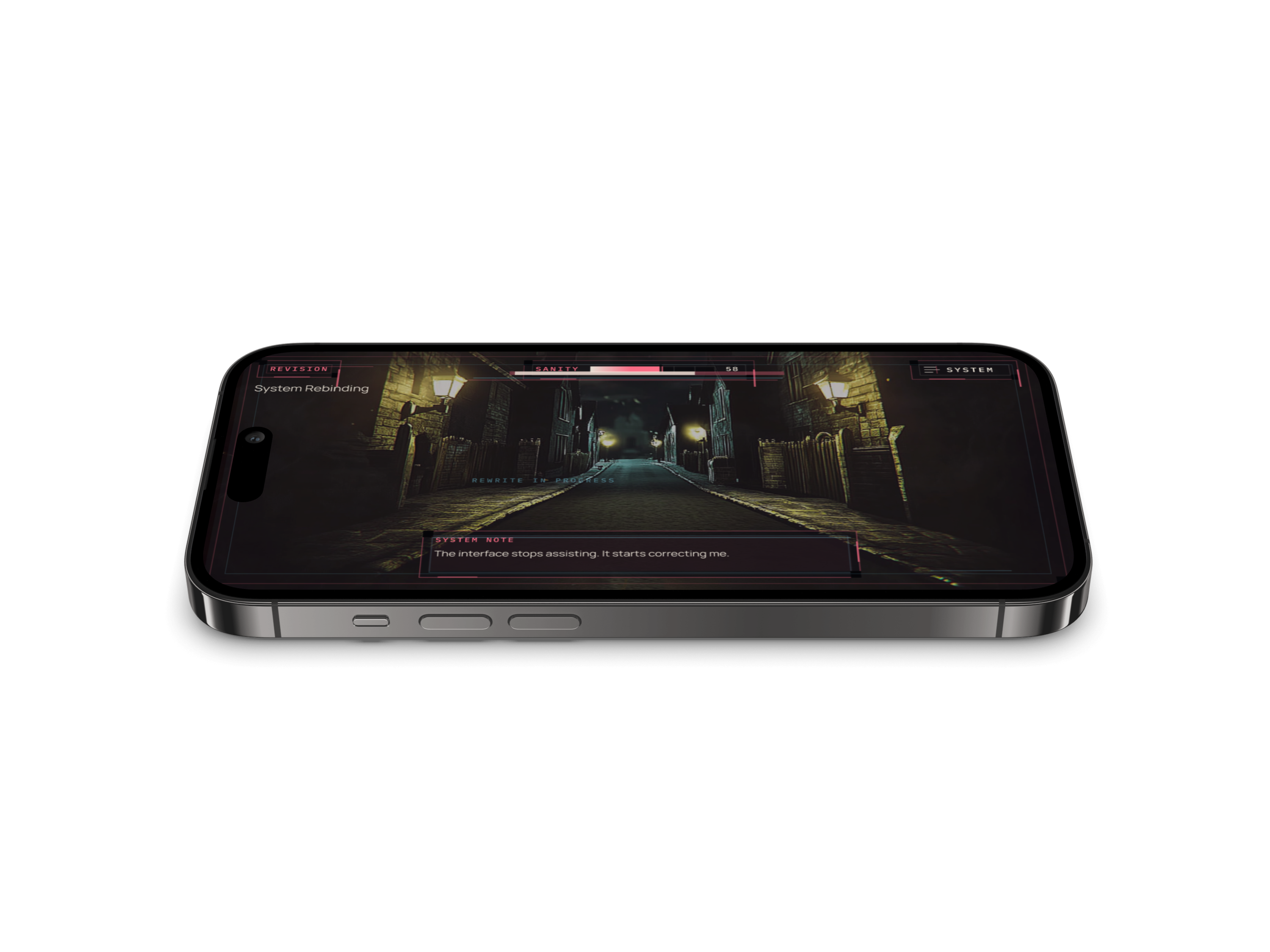
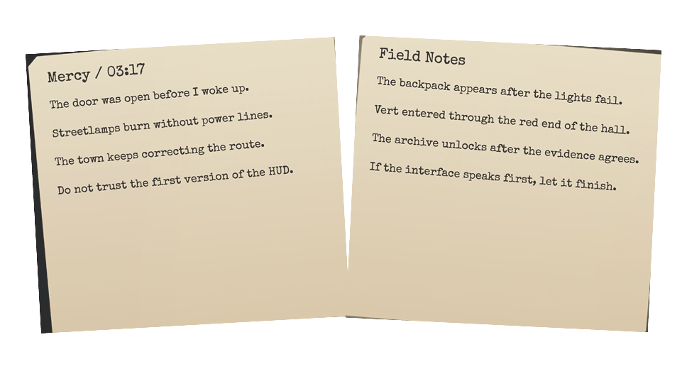
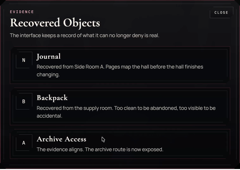
The evidence state combines inventory status, branching actions, and system notes in one layout. It shows how ReWritten keeps interaction readable while still feeling unstable.


This pass makes the case study clearer about what ReWritten is actually proving: not a fully built game UI, but a concept system for how a mobile horror interface can use hierarchy, feedback rhythm, evidence handling, and consequence framing to heighten tension without sacrificing legibility.
Core Focus
Choice-driven mobile UI
Strongest Proof
Screen system + flow video
Next Asset Value
Motion / branching prototype
Takeaways