Case Study
Vymble
Helping friend groups break out of routines and align on what to do together, by matching group moods and surfacing lightweight, spontaneous suggestions.
TL;DR
A mobile concept that helps friend groups pick plans from a shared mood.
Research, IA, interface design, prototyping, and usability testing.
A high-fidelity prototype focused on mood matching and quick group planning.
59% of testers said they'd use it daily
A visual system built for fast group decisions, not endless browsing.
process notes
Research & Constraints
Early interviews with 8 design leads revealed a consistent pain point: feedback was scattered across Slack threads, Figma comments, and Loom videos. The core constraint was building something that respected the async nature of distributed teams while still feeling immediate and conversational.
Key Decision
We chose to anchor feedback directly onto the design artifact rather than as a separate thread. This meant building a custom annotation layer that could handle both pixel-precise pins and free-form area selections, which became the defining interaction of the product.
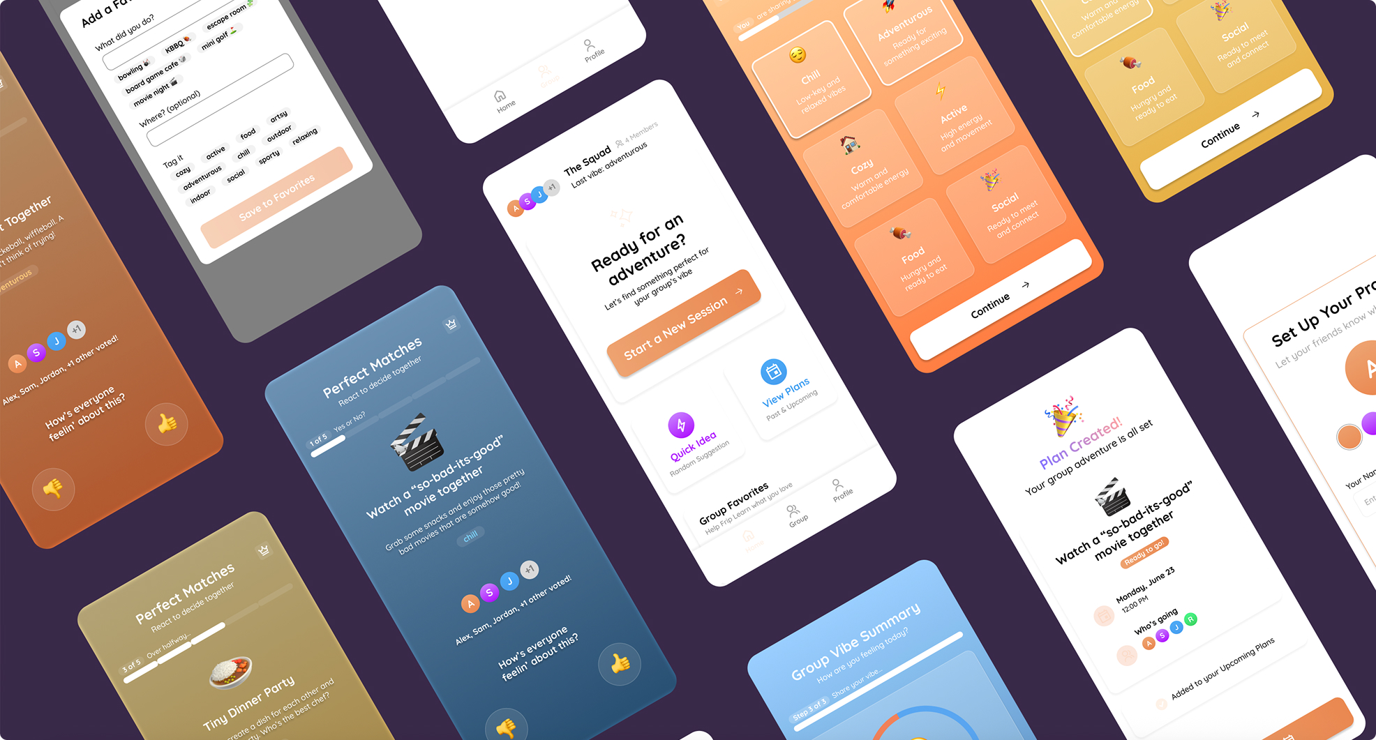
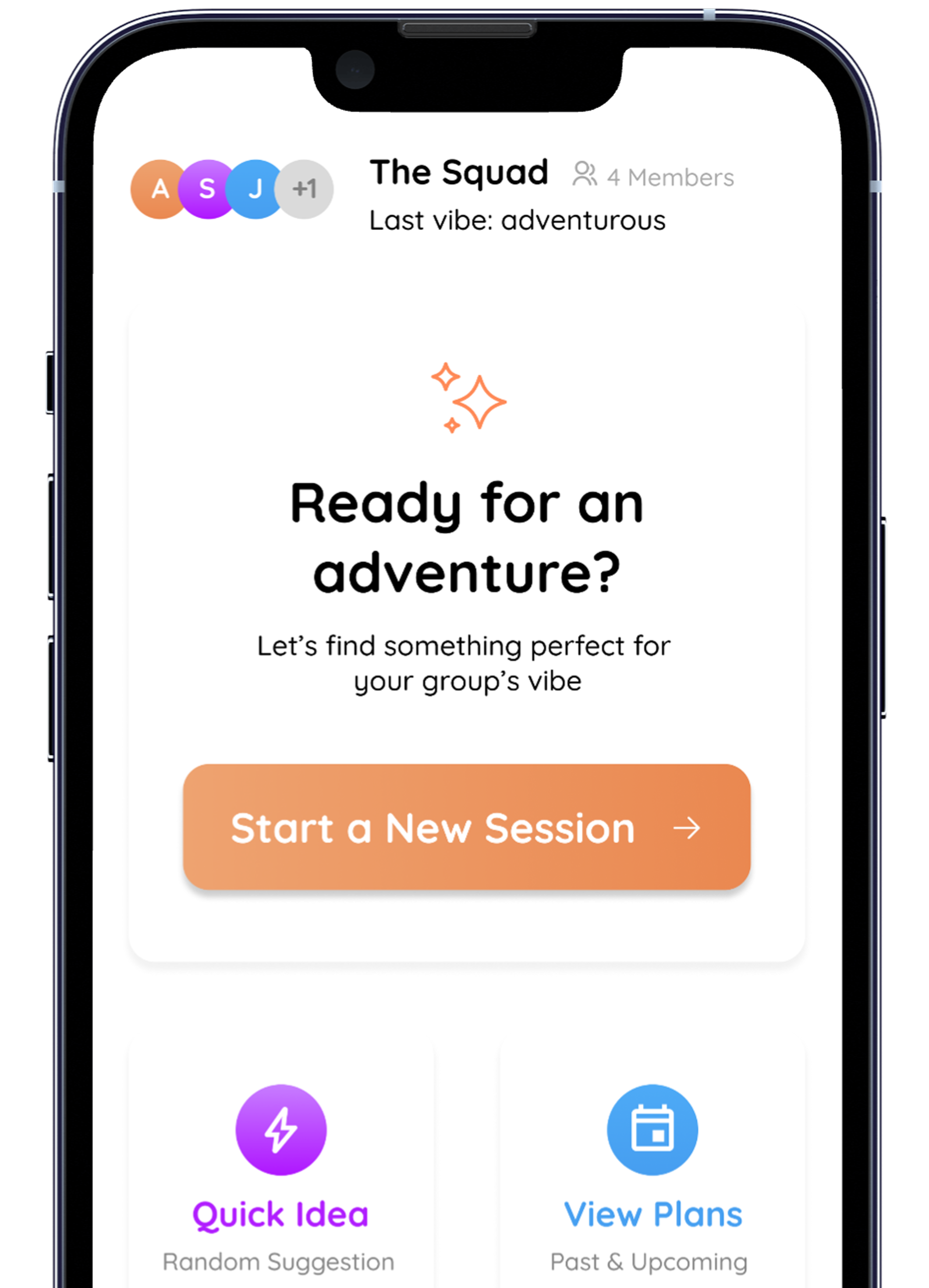
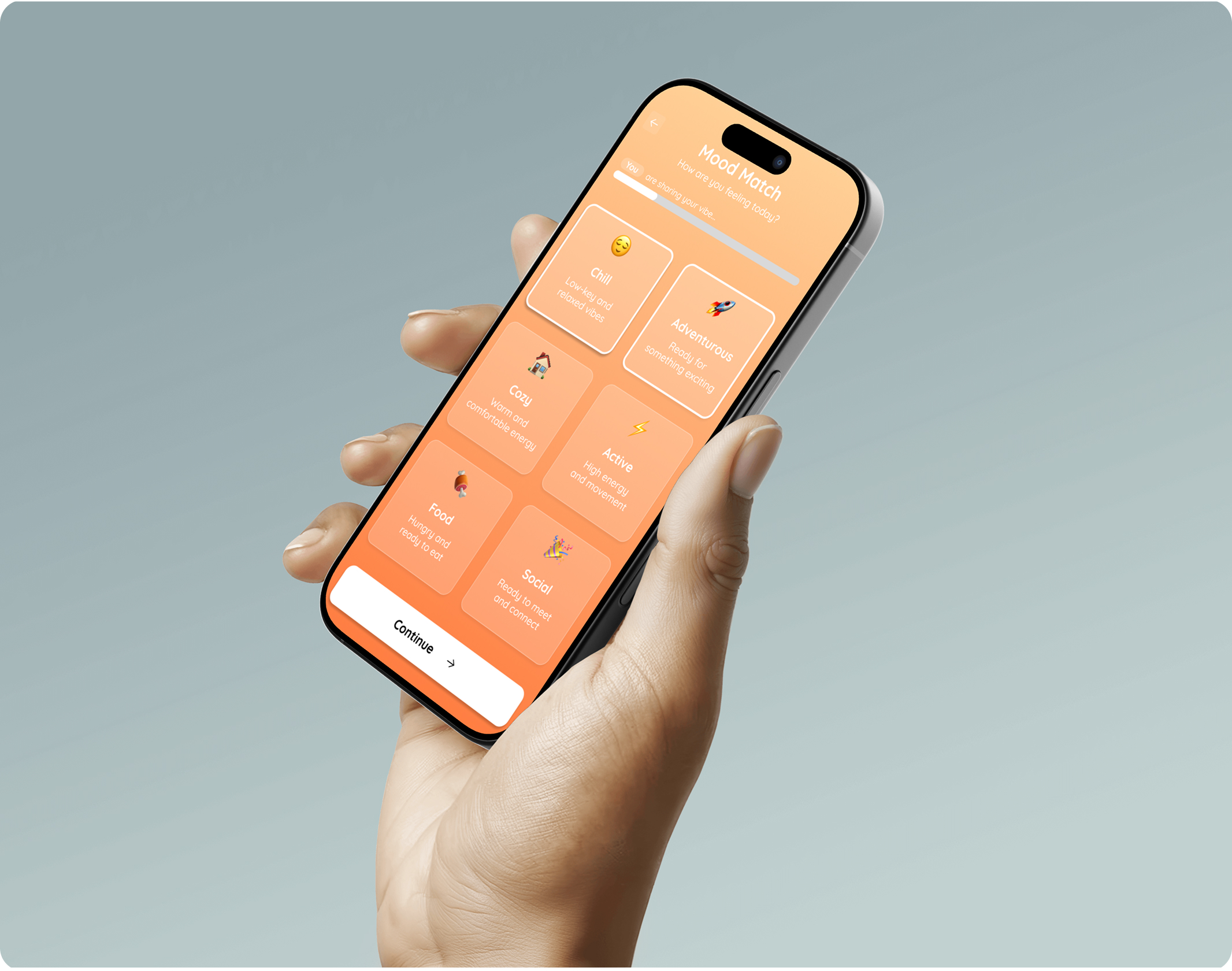
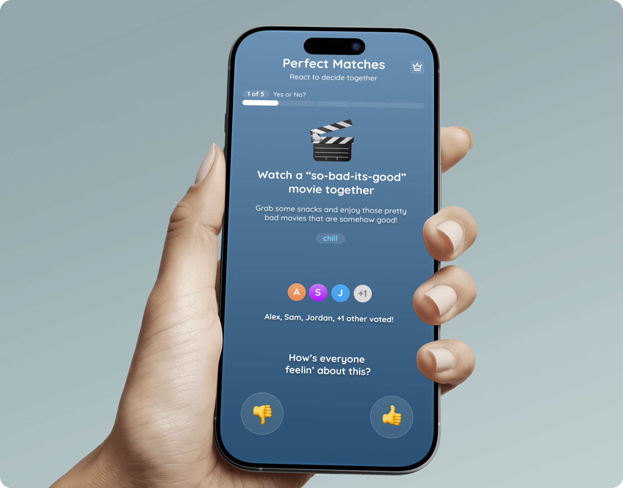
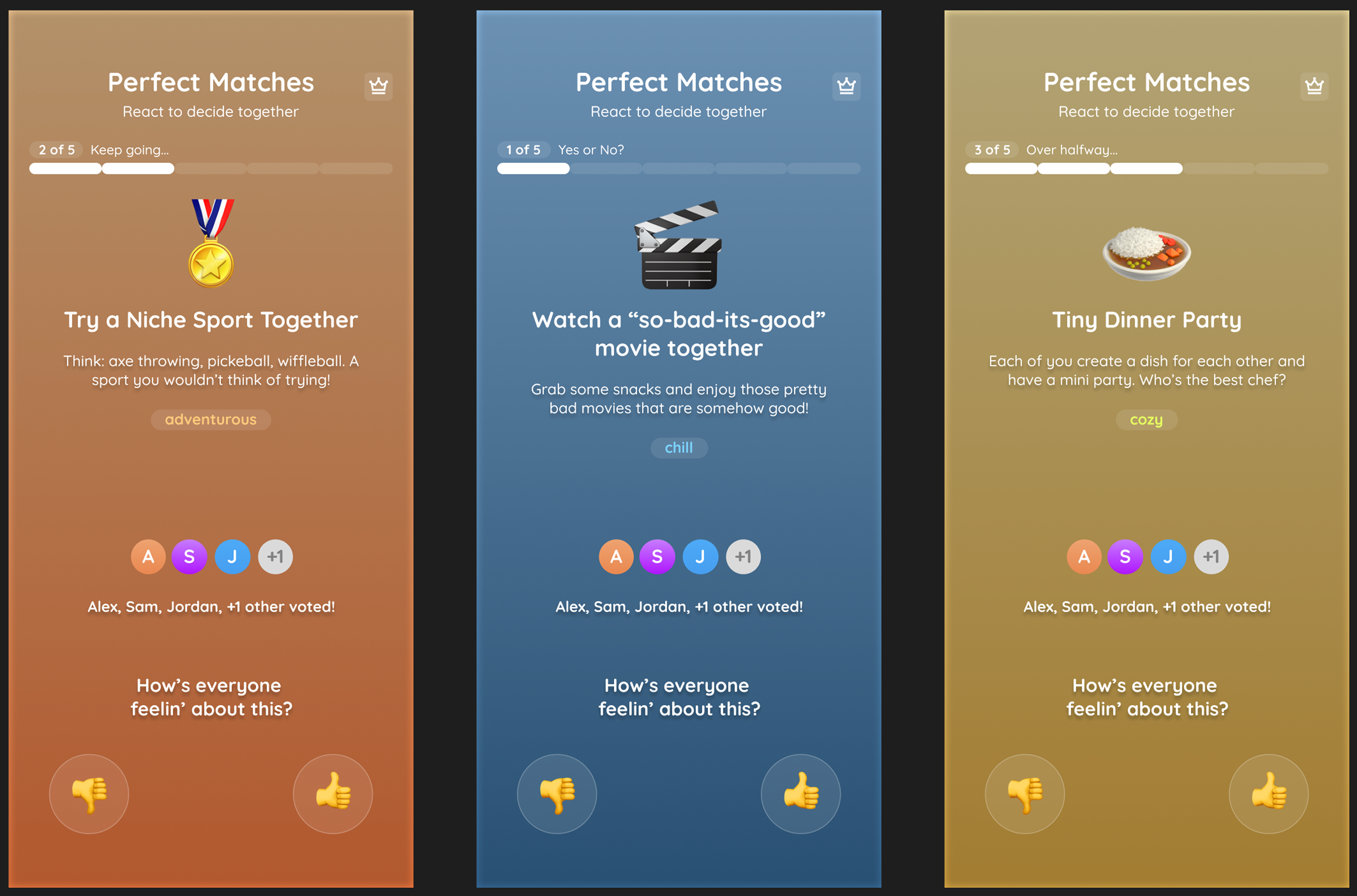
Mood matching drives the first decision and narrows options in seconds.
Group plans view with clear shared options.
Favorites state for quick repeat decisions.
Detail crop highlights quick save and group-favorite feedback states.
The final surface keeps planning lightweight, fast, and social.